A logo I made for Ryukin applied on different images.


Logo's I made for a friend who started his business as a personal trainer.


Corvee logo + interface sketch.

A logo I made for a friend who just started as a personal stylist.
Durf means dare in Dutch. The concept was based on “Dare to look in the mirror”.
Durf means dare in Dutch. The concept was based on “Dare to look in the mirror”.

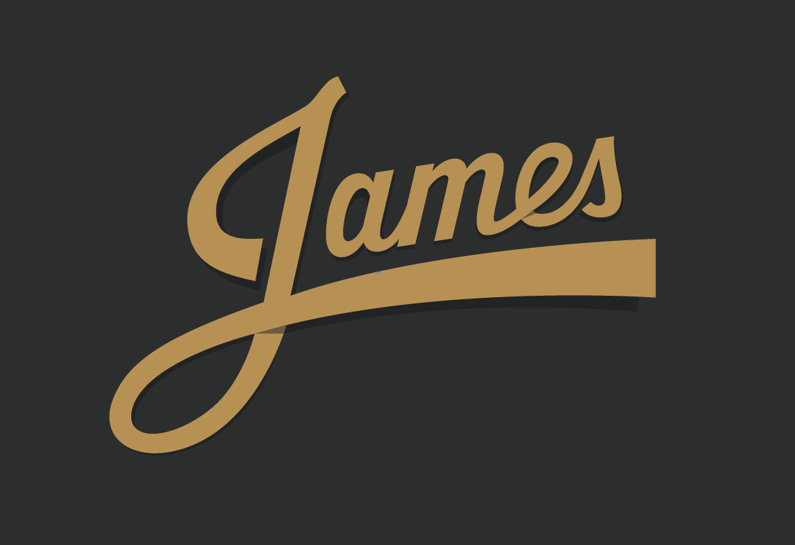
A logo sketch I made for my girlfriend who is a singer.

Logo for a company importing and selling mountainboards in Mexico called ixta. I wanted to experiment with both colours and typography and since they are all about mountains I have tried to incorporate those in there as well. This was a pretty experimental project.

Logo for a new company. Sander needed a logo that looked friendly, honest, open, yet professional and authentic.

Urban City Guide logo. While making these letters I was inspired by the concrete blocks of the city. The green colour was chosen because this start-up originated in Rotterdam.

Logo proposals for a stylist.
1. The first logo proposal was inspired by the meaning of the name Esmiralda which derives from a gemstone called an emerald. Since gemstones are generally worn to enhance ones visual appearance I turned the E into an gemstone looking mark.
2. The second logo proposal was much more minimal in its execution. I used a typeface that looks pretty, simpel, and friendly and just used a few of the quirky loops to style it a bit more like a pretty lady would wear a necklace, bracelet or earrings.


Logo proposal for a company who organizes parties. I wanted to make something easy to recognize on small flyers as well as large posters and as a logo mark as well as a the whole logo. By merging the i and the m together and cutting out the sharp corner I enhanced the readability of the 2 letters as well as emphasized on the maniacs part.

This logo I made for a journalist whose name is Naomi. I chose her first name because she wanted something personal and informal. Simply by adding a few rounds to the letter A I was able to communicate both her name as the fact that she was a reporter who writes articles (I could have paid a bit more attention to the kerning of the letters though). ;o)

Logo proposals.


Monkeytree proposal.

Personal wordmark for Thinkleft.nl

Logo proposal for vocalist Gretz who wanted something edgy, with a bit of an old-school rock feeling. I created a wordmark that is both simpel, timeless and has a bit of that 80's rock feel to it.

Lettering for my new-born son =)